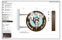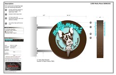
i got two proofs today from the sign maker. help me decide!
do we like blue or white neon better?
do we like the "homemade ice cream" big and outside the blue circle, or do we like it inside the blue circle, but smaller?
do we like blue or white neon better?
do we like the "homemade ice cream" big and outside the blue circle, or do we like it inside the blue circle, but smaller?


7 comments:
I like the white neon 'cause it's classic and simple. I also like the smaller "homemade ice cream" inside the circle because it makes parker's face pop out of the design a bit more. It's still going to say "ice cream" in big block letters over the awning, no?
If I could disagree, I like the blue because it jumps out at the eye far more quickly (at least in this size) and I like the "homemade ice cream" in the circle (as opposed to inside of it) because it makes the dog less cluttered.
Well, my two cents:
I like the white neon, like Andrea, with the writing outside the circle, like Jenny. For the same reasons they said...
I like the big writing on the outside and the blue neon
I know I'm late to the party, but I vote blue and the writing outside the circle. The blue just pops and I think the dog needs his own space to enjoy his treat.
I like the white neon with the type within the brown circle.
Blue neon. "Homemade ice cream" outside the circle.
Post a Comment